Prism
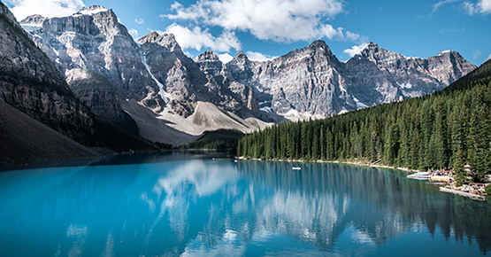
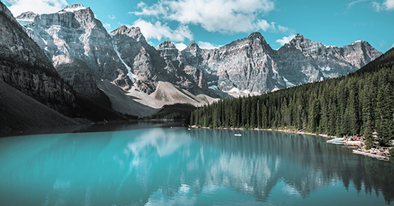
Prism is reminiscent of 3-strip technicolor, which uses red, blue, and green channels. It is extremely saturated, imparting an aqua character to neutral gradients.
- Classic Technicolor effect from the 1940s and 1950s
- Increased contrast, with desaturated greens, aqua blues, and deeper reds shifting to magenta
- Pure teals and blues dominate
- Good skin tones
- Saturated and punchy; playful
Photo credit: Leonardo Merlo
Maxwell
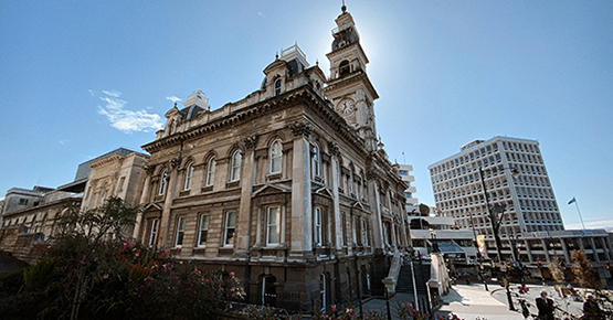
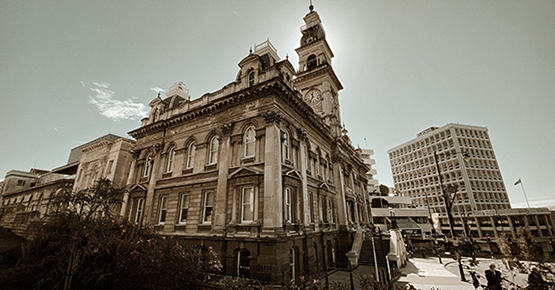
Inspired by the research of James Maxwell, this simulation seeks to reproduce color images via a front-projection 3-color process. Maxwell’s work would later be expanded upon by Sergey Prokudin-Gorsky.
Photo credit Maria Clara


Lumière
This simulation is based on the Autochrome mosaic screen plate process, an early film made with potato starch with red, green, and blue color crystals. While its color palette and innate saturation is extremely limited, it will reproduce red, green, and lavender with moderate accuracy.
- Initially not suitable for Asiatic and African skin, this filter is modified to widen the skin tone range
- Reds and greens become dark and primary
- Desaturated, dream-like impressionist quality
Photo credit: Yogendra Singh


Judith
Judith is a replication of the 2-strip technicolor process using red-orange and blue-green channels. It interprets all colors as shades of teal and clay.
- Otherworldly 1920s and 1930s motion picture effect
- Sky and water renders in teal
- Skin tones smooth out due to desaturation
- Use for portraits and scenes with a structured, graphic approach
Photo credit: Tyler Nix


Plus
Plus is an interpretation of the Kodak ColorPlus 200 pallette. Skintones are constrained to a pleasing but narrow tonal range. Blues are rendered a dreamy teal.
- Reds, yellows, and greens desaturate, while blues veer into teal
- Use in outdoor settings with sand, brick, or rock contrasted with blue sky, like a beach or desert
Photo credit: Sébastien Jermer


Gold
This simulation evokes Kodak Gold – it is both warm and saturated.
- Nostalgic, with bright sunny tones
- Emphasizes yellows and blues to create a warm feel
- Retains warm tones, even with flash
- Good for outdoor shooting, especially at sunrise and sunset
Photo credit: Eloise Ambursley


Lesko
A desaturated version of Portra 160, with a narrow color palette optimized for rendering pleasing skin tones
- Smooth, natural color palette that is balanced with medium saturation and low contrast
- Downplays redness in skin to create a smoothing effect
- Lack of color accuracy with reds, magentas, and oranges
- Use for portraits
Photo credit: Wilfred Sequeira


Gypsum
Gypsum exhibits the vibrancy of Kodak Portra UC. The entire color palette is optimized to produce luminant and pleasing skintones.
- Bold, saturated colors while retaining pleasing skin tones
- For portraits, but can also be used for general purpose
- Try it with scenes that need a color pop
Photo credit: Jorge Saavedra
Koda
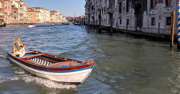
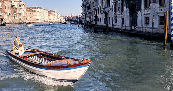
An interpretation of Kodachrome 40, faded after years of archiving
- Does a fair job of skin tones
- Oranges desaturate, greens avocado
- Early to mid-century vibe
- Classic National Geographic look; landscape/street photography
Photo credit: Paulé Wood


Leopold
The color palette of Kodachrome 64, hybridized with the brown-biased black point of an aged Kodachrome 25 transparency
- Dramatically transform greens, with beautiful saturated clay-colored reds
- Warm tones, including skin tones
- Kodak 64 was optimized for white skin tones; the hybridization with Kodachrome 25 makes this filter work with all skin tones
Photo credit: Godisable Jacob
Veloura
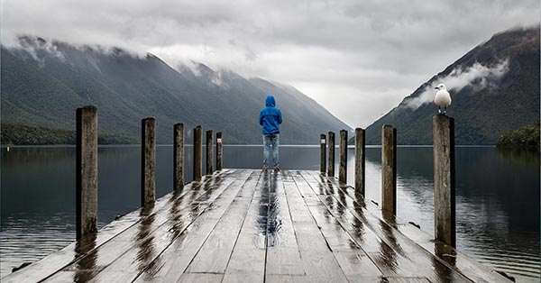
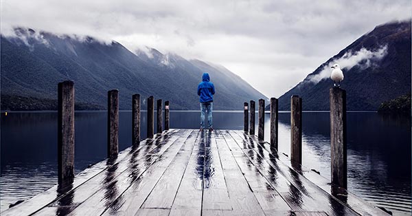
- A simulation of Fuji Velvia 100, underexposed by ½ stop
- Deep shadows with a strong blue cast
- Deep inky blacks, high contrast
- Rainy days and twilight scenes; blue/golden hour compositions
- Not intended for portraits
Photo credit: Gabriela Palai
Layton
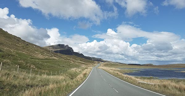
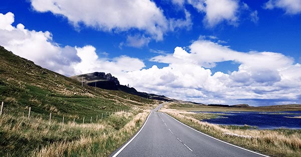
Based on Kodak Ektachrome, this vibrant simulation exhibits striking cobalt blues.
- Cobalt pure blues
- Use for skies and seascapes; a natural dehazer for landscapes
- Not intended for portraits
Photo credit: Naomi August

Bingham
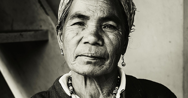
Based on the daguerreotype flat-plate process, with wider spectral sensitivity and high mid-tone contrast to enhance fine textures
- Far less sensitive to red, renders lots of skin texture
- High contrast
- Use for street photography
Photo credit: Yannes Kiefer


Electrum
A simulation based on the legendary Kodak Tri-X, this moderate contrast film is suitable for a wide range of compositional scenarios.
- Used widely for photojournalism in the 1960s
- Has a slightly aggressive contrast
- Slightly less sensitive to red; darker skies
- Imparts texture to the skin without appearing rough or cratered
Photo credit: Johann Walter Bantz
Salt
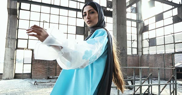
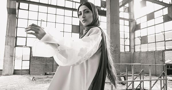
Based on a printing process used to enlarge and publish B&W film, with a subtle red/yellow color cast
- An overall ochre/reddish tone, sensitive to blue
- Reproduce a vintage look; nostalgic
- Good for architecture, textured cityscapes, and ruins
Photo credit: Nojan Namdar


Noir
A high-contrast, neutrally panchromatic rendition of 1940’s B&W motion picture film, with dark, almost featureless shadows
- Extreme contrast, with deep inky blacks
- Use for shots evoking drama, mystery
Photo credit: SHAYAN rti
Seventh
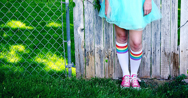
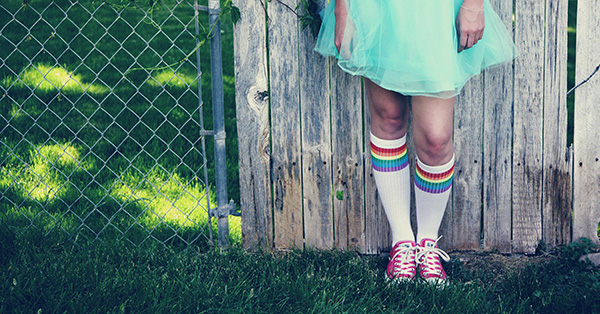
Based on Polaroid 669, with a cool color cast and low innate contrast
- Daylight balanced
- Use for portraits and scenes that evoke a retro feel
Photo credit: Sharon McCutcheon


May
Reminiscent of Impossible 600 Color instant film, rendered with a slightly wider color palette
- Desaturated, with soft textures that make analog photography so distinctive
- Chalky skin tones, darker midtones
Photo credit: Eva Grey


Ulster
Reminiscent of expired Polaroid 600 Color instant film, with a sepia color overlay
- Low contrast
- Great for portraits with a vintage feel
Photo credit: Tracey Hocking


Crescent
Based on underexposed Fujifilm Instax 400 Instant Film, this simulation is low contrast, with denim-blue shadows
- Vintage northern-light feel
- Good for moody portraits and street scenes
Photo credit: Kaylah Matthews


Roxa
Based on aesthetic cues from Lomochrome Purple, this simulation paints in cyanic and violet hues
- Blue becomes green, green becomes purple, yellow becomes pink, red loses saturation
- Create fantastical portraits and landscapes
- Skin tones become less saturated
- Works best with bright scenes
Photo credit: Joe Ciciarelli
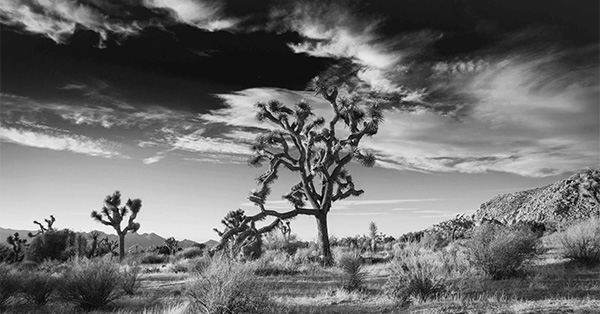
Via
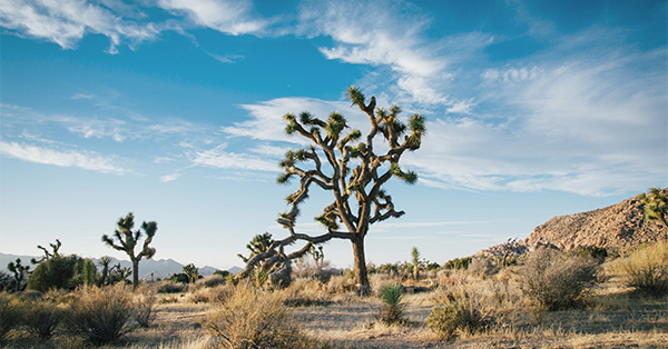
A simulation of a high-contrast monochromatic infrared film which will render blue skies an inky black
- Create dramatic sky effects, emphasizing cloud contrast for landscapes
- Simulate a moonlit scene at midday with slight underexposure
- Extreme contrast with skies; turns foliage white and cuts through fog and haze
Photo credit: Elliott Engelmann
Callaïs
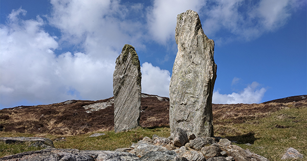
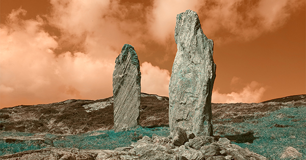
Inspired by Lomochrome Turquoise, this is a false-color film. Light tones and colors in the scene will take on varying bluish colors, ranging from aqua to cobalt, while greens will be intensified and blues will reverse to a yellowish golden glow.
- Warm colors become blue, blue becomes golden and green becomes emerald
- Works best with bright scenes containing blue and green, like sky and grass
Photo credit: Paulé Wood
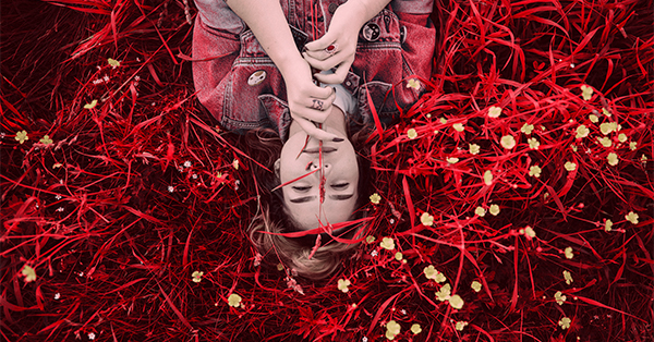
Redscale
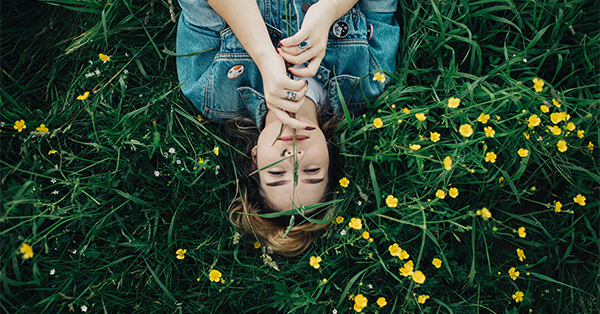
Kodak Aerochrome was a false-color reversal film designed for “vegetation surveys, camouflage detection and earth resources.” Chlorophyll from the vegetation reflects infrared light, and the healthier the vegetation, the more vibrant the red tones.
- Use with scenes that contain a lot of green vegetation
- Skin tones take on a pinkish hue
Photo credit: Wes Hicks


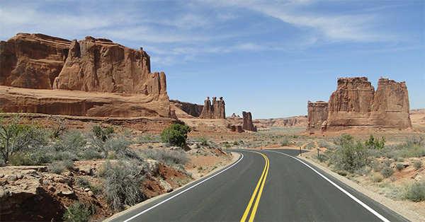
Cyanotype
A reproduction of Cyanotype, one of the most prolific optical printing processes of the 20th century. It pre-dated photocopies, used to reproduce technical drawings for engineering and architecture.
- Renders tones in cream and blueprint blues
- Extremely high contrast
- Unsuitable for darker skin tones, blows out lighter skin tones
Photo credit: Candice Picard
Lumen
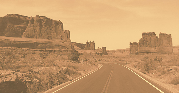
A simulation of a gum bichromate photographic printing process developed in the 19th century, this simulation renders in saturated ochre hues.
- Low contrast, monochromatic and desaturated yellows and oranges
- Reminiscent of the dawn of photography
- Use to capture a historical feel
Photo credit: laze.life


Tyrian
A reproduction of a Cyanotype optical print on a purple-dyed substrate
- Extremely high contrast
- Great for architecture and signage
Photo credit: Maarten van den Heuvel
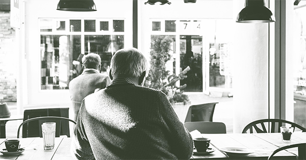
Fern
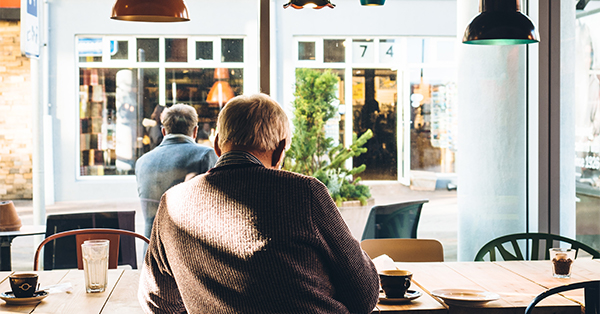
An interpretation of the subtle green color cast common on some deteriorated gelatin silver halide prints
- Maintains detail while increasing contrast
- Reds, yellows, and greens darken, while blues go lighter
- Skin tones get denser
- Good for timeless street scenes and landscapes
Photo credit: Jeff Sheldon